A-2
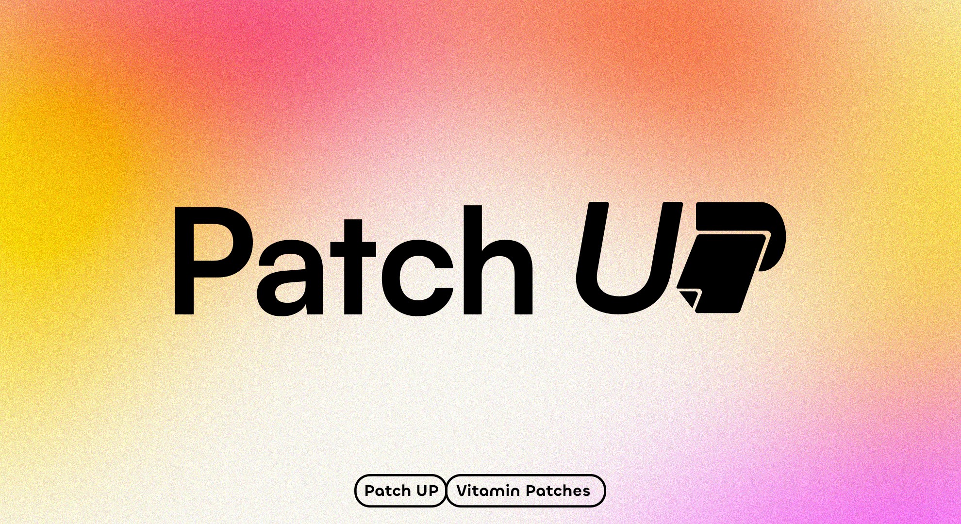
PATCH UP
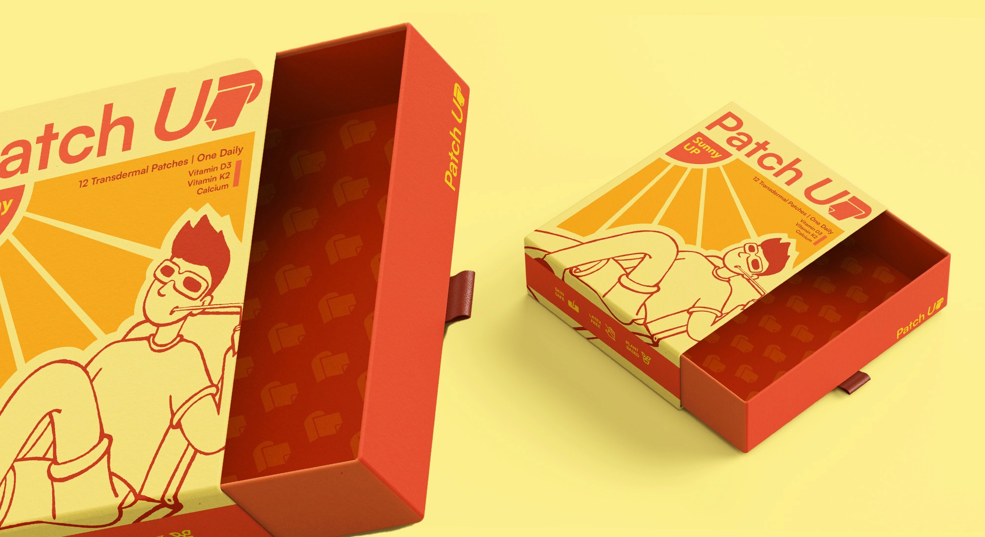
PatchUp had the innovation. A smarter, more convenient way to deliver daily vitamins, designed for people who don't have time to slow down. What it needed was a visual identity that could communicate that value as clearly as the product delivered it.
Nab Dat redesigned the packaging and visual language from the ground up, building a cleaner, more modern identity that reflects the simplicity and purpose at the heart of the brand. Every design decision was made to reduce friction and increase confidence at the point of discovery.
The result is a brand that earns trust before a single patch is opened.
YEAR
2026
PROJECT SCOPE
ART DIRECTION
BRAND STRATEGY
IDENTITY DESIGN